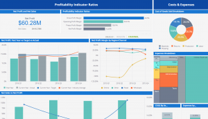
 I am not and have never been a numbers person. As a matter of fact, looking at numbers and data intimidates me and quickly bores me. I have witnessed various project presentations–whether related to math, science, or social sciences. One problem that many data presentations tends to have in common is that they are not presented creatively or in a way that really makes them memorable. There are some ways to make these presentations more interesting, and the good news is that it doesn’t take much effort at all.
One useful tip that I learned while pulling and presenting my own data sets is to be visually creative so that the data doesn’t look like an eyesore. It can be overwhelming to see plain data sets with numbers that don’t 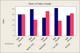 seem to make much sense. One tactic that can be used to help break up the information and make it “pop” is to use plenty of colorful graphs. By playing with different buttons and charts on Tableau, I have learned that there are plenty of ways to create a visually appealing chart that highlights relevant information without losing an audience. Different categories can also be highlighted in different colors so as not to make the graphs look plain. For example, when laying out data gathered from men and women, the bars on a graph representing men can be colored in blue while pink bars can represent women. This not only makes the data easier to digest, but it helps viewers understand how to differentiate the information.
 seem to make much sense. One tactic that can be used to help break up the information and make it “pop” is to use plenty of colorful graphs. By playing with different buttons and charts on Tableau, I have learned that there are plenty of ways to create a visually appealing chart that highlights relevant information without losing an audience. Different categories can also be highlighted in different colors so as not to make the graphs look plain. For example, when laying out data gathered from men and women, the bars on a graph representing men can be colored in blue while pink bars can represent women. This not only makes the data easier to digest, but it helps viewers understand how to differentiate the information.
This brings me to my next point. Images are also great resources that help string together data collected. 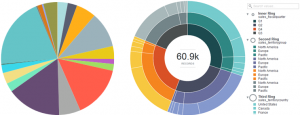 By using images relevant to the data, the information laid out becomes more inviting. For example, a photo can be used with pie charts placed over different sections of the photo. Numbers are NOT my friend and I find information much easier to understand when it is set up visually.
 By using images relevant to the data, the information laid out becomes more inviting. For example, a photo can be used with pie charts placed over different sections of the photo. Numbers are NOT my friend and I find information much easier to understand when it is set up visually.
One other really cool effect that can be used to display data is the powerpoint chart animation feature. This option allows you to animate charts in such a way that you can see a line as it is being drawn across a chart or you can even understand in which order the data should be set up. This is a user-friendly feature that almost acts as a “tutorial” of sorts so that people truly understand why data might be presented in a certain 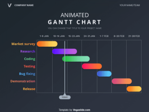 way.
way.
 way.
way.Another incredibly useful tip is to consolidate data as much as possible and keep the presentation clean. When there is an overabundance of information that doesn’t seem to make much sense, it is simple to get lost in the confusion. By displaying only the data that is absolutely relevant and keeping the presentation method (whether it be a chart, graph, etc.) tidy, holding a viewer’s attention might not be so difficult. The way data is presented is also a representation of the brand you may be marketing for so it is important to put forth effort in order to effectively and professionally represent said brand.
Collecting data can sometimes be a long and difficult feat, so it is our job as marketers to simplify this data and then interpret and present it in a way that everyone can understand. When you invest time and energy into collecting valuable information, the last thing you want to do is have it ignore or discarded because it cannot be interpreted. It is important to optimize the data so that it results in an impactful research project.